

Are you familiar with Comic Sans?
The font has been a subject of both admiration and disdain. Created in 1994, it has sparked endless debates in design circles and beyond. Loved by some for its playful charm and readability, loathed by others for its overuse and perceived lack of professionalism, Comic Sans occupies a unique place in the typographic landscape.
Most of us know Comic Sans as the font of memes.
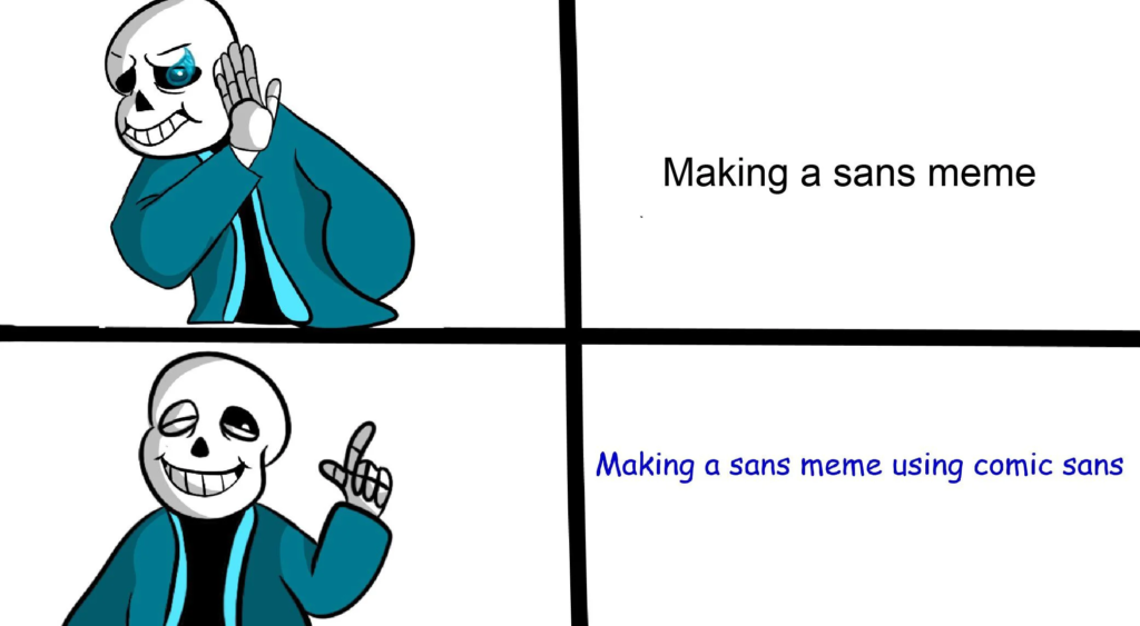
And perhaps it is this association with silly pop culture that makes it hard for us to take Comic Sans seriously. Can you imagine writing a book in Comic Sans? Ridiculous!
But not so fast. After struggling to gain momentum on a new book recently, I tried the unimaginable – writing in Comic Sans. The result was miraculous. Its silly, easy-going appearance removed a significant amount of stress from the drafting process. Have you heard the saying “a first draft only needs to exist”? When written in Comic Sans, it’s hard to take anything I write seriously aside from getting it on digital paper:
I have to say, there’s something to be said for writing a book in a font that looks like an eight year old’s diary. As writers, we take ourselves too seriously. I would say I feel silly using it, but I also wrote 25,000 words in 12 days with minimal effort, so you tell me what’s silly or not. For professionalism, Comic Sans rates -1, but for ease of use, I give it 9/10 highly recommend.
Leave a Reply